

Dark Mode is no longer a nice-to-have on iOS. Since Apple shipped it back in iOS 13, users expect every app on their home screen to switch gracefully when the system appearance changes. At Iris, we design a lot of iOS interfaces for clients across fintech, health, and productivity, and we’ve noticed the same mistakes appearing again and again when teams try to retrofit a dark theme onto an existing light UI.
This guide is a distilled version of the internal checklist we use when tackling iOS dark mode design. It focuses on the practical decisions, not the theory: how to adapt colors, what contrast ratios to hit, how to organise assets in Xcode and Figma, and the traps that will burn you before App Store review.
Why Dark Mode Deserves Real Design Effort
A common misconception is that Dark Mode is just “inverted colors”. It isn’t. Apple’s Human Interface Guidelines describe it as a systemwide appearance tailored for low-light environments, with its own semantic color system, elevation rules, and vibrancy behaviour. Treating it as a color swap produces muddy interfaces, unreadable text, and broken brand consistency.
On client projects we treat Dark Mode as a parallel design system, not a variant. That mindset shift is what separates a polished app from one that looks like it was ported in an afternoon.

1. Start With Semantic Colors, Not Hex Values
The single biggest lever for a clean dark mode implementation is using semantic (dynamic) colors from the start. Apple provides a full set through UIKit and SwiftUI, and they automatically adapt to the current appearance and accessibility settings.
Instead of naming your tokens gray100 or #F2F2F7, name them by role:
- backgroundPrimary, backgroundSecondary, backgroundTertiary
- labelPrimary, labelSecondary, labelTertiary
- separator, fill, tintAccent
Each token maps to two values: one for light, one for dark. When a designer or developer picks labelPrimary, they never have to think about the mode again. This alone eliminates about 70% of the dark mode bugs we see in audits.
Mapping Apple’s system colors to your brand
We usually keep Apple’s systemBackground family for surfaces and only override the accent color. It’s tempting to fully custom-brand every surface, but Apple’s grays are calibrated for OLED displays and elevation. Fighting them costs more than it delivers.
2. Hit the Right Contrast Ratios
Dark mode contrast is trickier than it looks. Pure white text on pure black (#FFFFFF on #000000) technically scores the maximum WCAG ratio, but it produces halation, that ghosting effect where text feels like it’s vibrating. We avoid it.
Our internal minimums for iOS:
| Content Type | Minimum Ratio | Studio Target |
|---|---|---|
| Body text | 4.5:1 | 7:1 |
| Large text (17pt+ bold, 20pt+ regular) | 3:1 | 4.5:1 |
| UI controls, icons | 3:1 | 4.5:1 |
| Disabled states | No requirement | 2:1 minimum for legibility |
We use off-white (around #EBEBF5 at 100% opacity) for primary text on dark backgrounds. It’s Apple’s own choice, and it drops eye strain noticeably in user testing.

3. Use Elevation Instead of Shadows
Shadows barely exist in dark mode. They can’t visually separate a card from a black canvas the way they do on white. iOS solves this with elevation through lightness: the higher a surface sits, the lighter it becomes.
Our default stack for dark mode surfaces:
- Base background: #000000 or #1C1C1E
- Grouped background: #1C1C1E
- Card / elevated surface: #2C2C2E
- Modal or sheet: #3A3A3C
Combine this with a subtle 1px border at very low opacity if you need extra separation, but resist the urge to add drop shadows. They rarely help.
4. Rework Your Accent Color for Dark Backgrounds
Brand colors that look punchy on white often become aggressive or muddy on black. A saturated blue like #0066FF may pass contrast on white but glow uncomfortably on dark. We almost always create a dark-mode accent variant that is slightly desaturated and lifted in luminance.
Quick rule we apply:
- Reduce saturation by 10 to 20%
- Increase lightness by 5 to 15%
- Test against #1C1C1E, not #000000, because most iOS surfaces sit above pure black
5. Manage Assets Properly in Xcode
The asset catalog in Xcode supports Any, Light, Dark appearance slots for both colors and images. Use them from day one. Here’s the workflow we hand off to developers:
- Colors: define every token as a Color Set with light and dark values, then reference via
Color("labelPrimary")in SwiftUI - Illustrations: export two versions if the artwork uses colored fills; export one PDF template if it’s monochrome and can be tinted
- Icons: prefer SF Symbols. They inherit color and adapt automatically
- Logos: ship a dark-mode variant, especially if your logo has a dark wordmark
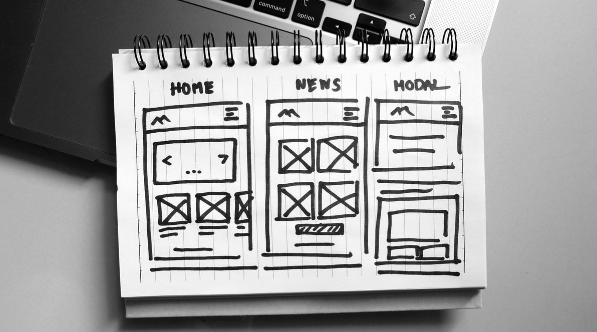
In Figma, we mirror this with variables and modes so designers can toggle appearance and validate every screen in seconds.
6. Watch Out for Images, Photography, and Videos
User-generated content and photography are the most overlooked part of dark mode. A photo with a white background will punch a hole through your dark canvas. Options we use depending on the project:
- Add a subtle border or rounded container around media
- Apply a very light overlay (5 to 8% black) on images shown in dark mode to reduce brightness
- For hero videos, use vignettes rather than dimming the whole asset
For illustrations, we now design them in both modes from the start. Retrofitting is always more painful.
7. Test Real Devices, Not Just the Simulator
The iOS simulator renders colors on your monitor, not on an OLED panel with true blacks and different gamma. We’ve shipped dark themes that looked perfect in Figma and the simulator, then felt washed out on an actual iPhone.
Our checklist before signing off:
- Test on at least one OLED device (iPhone 12 or newer)
- Test in bright sunlight and in a completely dark room
- Enable Increase Contrast in Accessibility settings and verify nothing breaks
- Enable Reduce Transparency and check vibrancy fallbacks
- Toggle appearance rapidly during navigation transitions to catch flashing
8. Avoid These Common Pitfalls
The mistakes we flag most often during design reviews:
- Hardcoded hex values scattered through the codebase or design file
- Pure black text on dark gray, or pure white text on pure black
- Colored shadows that disappear entirely in dark mode
- Illustrations with white backgrounds that were never redesigned
- Screenshots in the App Store that only show light mode, missing an opportunity to signal dark support
- Push notifications and email templates that ignore the setting entirely
- PDF exports and share sheets that render as dark artefacts when the user expects white paper
Bringing It All Together
Good iOS dark mode design is not about darkening a light interface. It’s about building a semantic system where colors, elevation, assets, and typography all know how to behave in either mode. When we approach a client project this way, the second appearance essentially designs itself once the foundations are correct.
If you’re planning a redesign or launching a new iOS product in 2026, treat dark mode as a first-class citizen in your design system from the first Figma frame. It costs far less than fixing it later, and users notice the difference the moment they turn out the lights.
FAQ
Is dark mode required for App Store approval?
No, dark mode is not mandatory, but apps that ignore it feel dated and reviewers often mention it. For any project targeting a modern audience we consider it a baseline requirement.
Should I let users override the system appearance?
Yes. Offer Light, Dark, and System as three explicit options in your settings. Some users prefer one mode regardless of the system state, particularly in reading or note-taking apps.
Does dark mode save battery on iPhone?
On OLED devices (iPhone X and later, except the standard iPhone XR and 11), yes, because black pixels are physically switched off. On LCD models the saving is negligible.
Can I use pure black (#000000) as my background?
You can, and Apple does in some places for OLED contrast, but combine it with slightly lighter surfaces like #1C1C1E for cards and modals. Pure black everywhere causes visual fatigue and makes elevation impossible to read.
How long does it take to add dark mode to an existing iOS app?
On projects we’ve audited, retrofitting dark mode to a mid-sized app takes between two and six weeks depending on how tokenized the current design system is. Starting from scratch with semantic colors makes it nearly free.