

Most iOS projects do not slow down because designers draw slowly or because developers write bad Swift. They slow down in the gap between the two: the screen that looks 4 points off, the blue that exists in six slightly different values, the button that behaves differently on three tabs. A shared iOS design system across Figma and SwiftUI closes that gap by turning opinions into tokens and tokens into code.
This is a practical walkthrough of how we set one up: defining color tokens, type scales and spacing rules in Figma, then mapping them one to one into reusable SwiftUI components. The goal is not a beautiful library file nobody uses. The goal is handoff efficiency: fewer review cycles, fewer pixel debates, and screens that stay consistent as the app grows from 8 screens to 80. The piece Apple Design Resources makes a good next read.
What an iOS design system actually contains
Before opening Figma, agree on the four layers. Everything else is decoration.
| Layer | In Figma | In SwiftUI | Who owns it |
|---|---|---|---|
| Primitives (raw values) | Variables: color/brand/500, 4pt spacing scale | Asset catalog colors, CGFloat constants | Design |
| Semantic tokens | Aliases: bg/canvas, text/primary, action/primary/bg | Color extensions, ShapeStyle helpers | Design + Dev |
| Components | Components with variants and properties | Views, ButtonStyle, ViewModifier | Dev, reviewed by Design |
| Patterns and docs | Usage pages, do and do not examples | Xcode previews, snapshot tests | Shared |
The single most valuable rule: screens never reference primitives. A screen uses text/primary, not neutral/900. That indirection is what lets you ship a dark mode, a rebrand, or a new Apple material without touching 60 files.
Start from Apple, then diverge on purpose
Do not rebuild the platform. Pull the current Apple Design Resources UI kit for Figma from developer.apple.com (Apple refreshes it every autumn after WWDC, so grab the latest release rather than an old copy floating in your team library). Use it for:
- Native bar heights, sheet metrics, tab bars and safe area behaviour
- SF Symbols and SF Pro text styles at correct sizes
- Current material and glass treatments introduced with iOS 26, so your mockups match what SwiftUI renders by default
Then keep your own library small and product specific: brand colors, product-specific cards, empty states, onboarding blocks, marketing-flavoured buttons. Two libraries, clear boundary. Anything Apple already gives you for free should stay Apple’s job, because it will keep evolving with the OS while your custom clone will not.
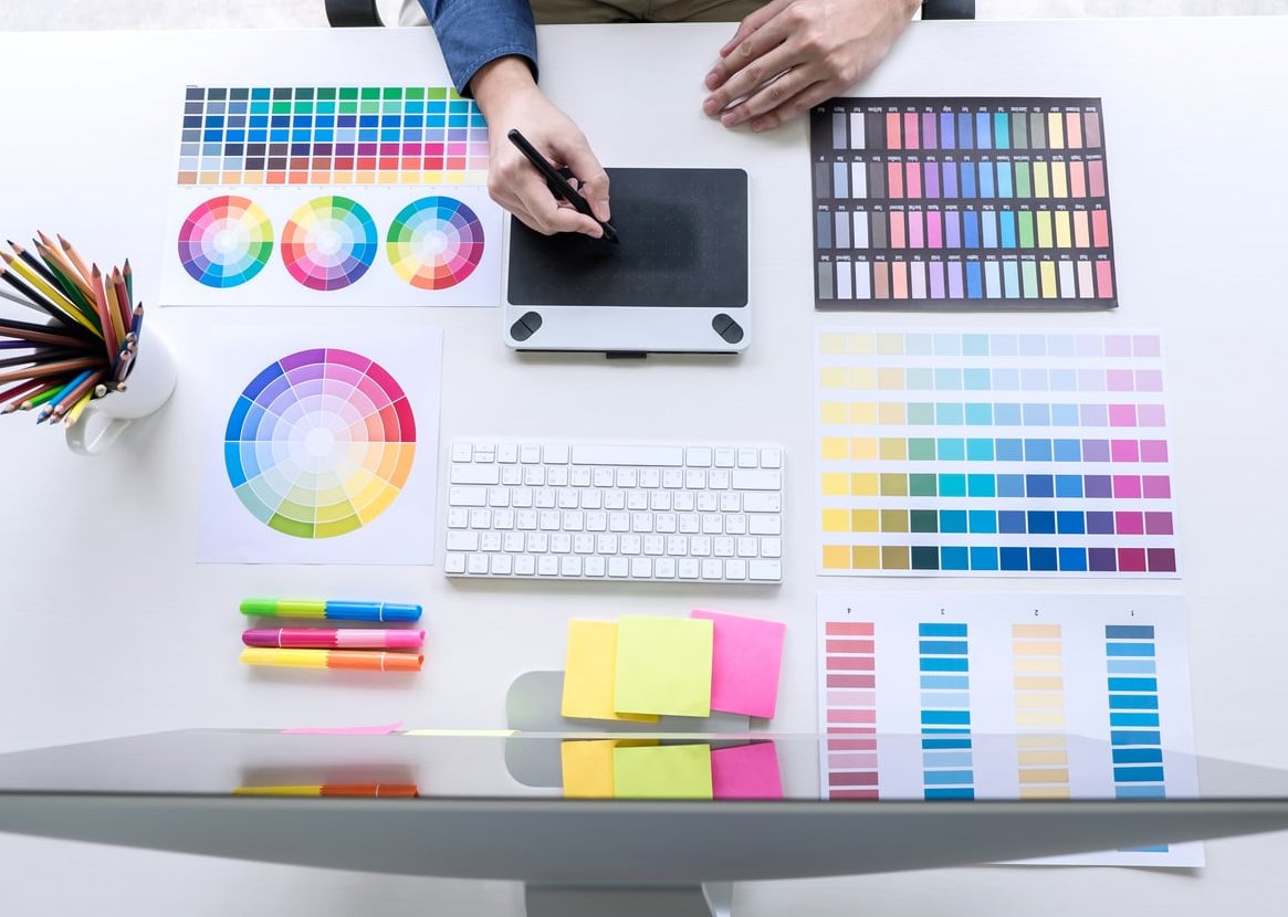
Step 1: Define color tokens in Figma variables
Use Figma variables, not styles, for color. Variables support modes, which is how light and dark stop being two disconnected files.
Build two collections:
- Primitives: a numeric ramp per hue. Brand 50 to 900, neutral 0 to 1000, plus success, warning, danger ramps. No mode switching here.
- Semantic: aliases that point at primitives, with a Light mode and a Dark mode.
Collection: Primitives
color/brand/500      #2F6BFF
color/brand/600      #2453D6
color/neutral/000    #FFFFFF
color/neutral/100    #F4F4F7
color/neutral/700    #3A3A42
color/neutral/900    #0B0B0F

Collection: Semantic  (modes: Light / Dark)
bg/canvas            Light: neutral/000   Dark: neutral/900
bg/surface           Light: neutral/100   Dark: neutral/700
text/primary         Light: neutral/900   Dark: neutral/000
text/secondary       Light: neutral/700   Dark: neutral/100
border/subtle        Light: neutral/100   Dark: neutral/700
action/primary/bg    Light: brand/500     Dark: brand/500
action/primary/label Light: neutral/000   Dark: neutral/000
Naming conventions that pay off later:
- Category first: bg, text, border, action, feedback. It sorts well and reads well in code.
- No literal color names in semantic tokens. “action/primary/bg” survives a rebrand; “blue/button” does not.
- Check contrast at token level, not per screen. Every text token must clear 4.5:1 against the backgrounds it is allowed to sit on.
Mirror the same names in Xcode
Create one Color Set in the asset catalog per semantic token, with Any and Dark appearances, and use the same path-style names. Then expose them once:
// DesignSystem/Tokens/Color+Tokens.swift
import SwiftUI

public extension Color {
    // bg
    static let bgCanvas   = Color("bg/canvas",   bundle: .module)
    static let bgSurface  = Color("bg/surface",  bundle: .module)
    // text
    static let textPrimary   = Color("text/primary",   bundle: .module)
    static let textSecondary = Color("text/secondary", bundle: .module)
    // border
    static let borderSubtle = Color("border/subtle", bundle: .module)
    // action
    static let actionPrimaryBg    = Color("action/primary/bg",    bundle: .module)
    static let actionPrimaryLabel = Color("action/primary/label", bundle: .module)
}
From this point, a code review rule applies: no raw hex, no Color(red:green:blue:), no .gray in feature code. If a token is missing, the fix is to add a token, not to hardcode a value. Someone has put together a good summary of it.
Step 2: Build a type scale that respects Dynamic Type
This is where most custom iOS design systems break accessibility. If Figma defines “Heading 20/24 bold” and the developer writes .font(.system(size: 20, weight: .bold)), text stops scaling and your app fails a basic accessibility pass.
Anchor your scale to Apple text styles instead. Define Figma text styles that map exactly to them at the default (Large) Dynamic Type size:
| Figma text style | Size / Line height (default) | Weight | SwiftUI |
|---|---|---|---|
| Large Title | 34 / 41 | Regular or Bold | .font(.largeTitle) |
| Title 1 | 28 / 34 | Regular | .font(.title) |
| Title 2 | 22 / 28 | Regular | .font(.title2) |
| Title 3 | 20 / 25 | Regular | .font(.title3) |
| Headline | 17 / 22 | Semibold | .font(.headline) |
| Body | 17 / 22 | Regular | .font(.body) |
| Callout | 16 / 21 | Regular | .font(.callout) |
| Subheadline | 15 / 20 | Regular | .font(.subheadline) |
| Footnote | 13 / 18 | Regular | .font(.footnote) |
| Caption 1 | 12 / 16 | Regular | .font(.caption) |
| Caption 2 | 11 / 13 | Regular | .font(.caption2) |
If the brand requires a custom typeface, keep the same eleven slots and scale relative to the platform styles:
// DesignSystem/Tokens/Font+Tokens.swift
import SwiftUI

public extension Font {
    static let dsBody      = Font.custom("Inter-Regular",  size: 17, relativeTo: .body)
    static let dsBodyStrong = Font.custom("Inter-SemiBold", size: 17, relativeTo: .body)
    static let dsTitle2    = Font.custom("Inter-SemiBold", size: 22, relativeTo: .title2)
    static let dsCaption   = Font.custom("Inter-Regular",  size: 12, relativeTo: .caption)
}
In Figma, add a note on each text style stating which SwiftUI token it maps to. That one line removes a whole category of Slack messages.
Two extra rules worth writing down:
- Designers must produce at least one screen mocked at a large accessibility size for any dense layout. It forces vertical stacking decisions early instead of during QA.
- No text style below Caption 2 for anything a user has to read.

Step 3: Set spacing, radius and layout rules
Spacing is the cheapest consistency win and the most common source of “this looks off” comments. Use a 4pt base scale, name the steps, and forbid arbitrary numbers.
| Token | Value | Typical use |
|---|---|---|
| space/2xs | 2 | Icon nudges, hairline gaps |
| space/xs | 4 | Label to caption |
| space/sm | 8 | Inside chips, icon to text |
| space/md | 12 | Stack spacing in lists |
| space/lg | 16 | Screen horizontal margin, card padding |
| space/xl | 24 | Between sections |
| space/2xl | 32 | Above primary CTA, empty states |
| space/3xl | 48 | Hero and onboarding blocks |
Add radius and hit-area tokens in the same collection: radius/sm 8, radius/md 12, radius/lg 16, radius/pill 999, and control/minHeight 44 (Apple’s minimum comfortable tap target). In Figma, apply spacing tokens through auto layout gaps and padding so a token change actually reflows components.
// DesignSystem/Tokens/Layout.swift
import CoreGraphics

public enum Space {
    public static let xxs: CGFloat = 2
    public static let xs:  CGFloat = 4
    public static let sm:  CGFloat = 8
    public static let md:  CGFloat = 12
    public static let lg:  CGFloat = 16
    public static let xl:  CGFloat = 24
    public static let xxl: CGFloat = 32
    public static let xxxl: CGFloat = 48
}

public enum Radius {
    public static let sm: CGFloat = 8
    public static let md: CGFloat = 12
    public static let lg: CGFloat = 16
}

public enum Control {
    public static let minHeight: CGFloat = 44
}
Step 4: Design components in Figma the way SwiftUI thinks
A component library speeds up handoff only if its structure resembles the code structure. Practical translation rules:
| Figma concept | SwiftUI equivalent | Guidance |
|---|---|---|
| Variant property (Style: primary / secondary / ghost) | ButtonStyle or an enum parameter | Keep variant names identical in both tools |
| Boolean property (Has icon) | Optional parameter or ViewBuilder slot | Prefer slots over 12 near-identical variants |
| Instance swap slot | Generic @ViewBuilder content | Use for cards, sheets, list rows |
| Auto layout: fill container | frame(maxWidth: .infinity) | Mark resizing behaviour in the component description |
| Interactive component states | configuration.isPressed, @Environment(\\.isEnabled) | Design pressed, disabled, loading, focused. Not just default |
Component checklist before anything enters the shared library:
- All five states designed: default, pressed, disabled, loading, error where relevant
- Only semantic tokens used, zero detached values
- Longest realistic string tested, plus a two-line wrap case
- Dark mode verified by switching the variable mode, not by duplicating frames
- Description field filled with the SwiftUI type name and one usage rule

Step 5: Map components into reusable SwiftUI code
Put the system in its own Swift package target (for example DesignSystem) so feature modules can only consume public tokens and components. That boundary is what keeps the system from decaying into a folder of loose views. You will find the same thinking at one studio that takes it seriously.
A button style, not a button view
Wrapping Button in a custom view loses accessibility behaviour and native gesture handling. Use ButtonStyle:
import SwiftUI

public struct DSPrimaryButtonStyle: ButtonStyle {
    @Environment(\\.isEnabled) private var isEnabled

    public init() {}

    public func makeBody(configuration: Configuration) -> some View {
        configuration.label
            .font(.dsBodyStrong)
            .padding(.horizontal, Space.lg)
            .padding(.vertical, Space.md)
            .frame(maxWidth: .infinity, minHeight: Control.minHeight)
            .background(
                Color.actionPrimaryBg.opacity(isEnabled ? 1 : 0.4),
                in: RoundedRectangle(cornerRadius: Radius.md, style: .continuous)
            )
            .foregroundStyle(Color.actionPrimaryLabel)
            .opacity(configuration.isPressed ? 0.85 : 1)
            .animation(.snappy(duration: 0.12), value: configuration.isPressed)
    }
}

public extension ButtonStyle where Self == DSPrimaryButtonStyle {
    static var dsPrimary: DSPrimaryButtonStyle { DSPrimaryButtonStyle() }
}

// Usage
// Button("Continue") { save() }
//     .buttonStyle(.dsPrimary)
A card with a content slot
public struct DSCard: View {
    private let content: Content

    public init(@ViewBuilder content: () -> Content) {
        self.content = content()
    }

    public var body: some View {
        VStack(alignment: .leading, spacing: Space.sm) {
            content
        }
        .padding(Space.lg)
        .frame(maxWidth: .infinity, alignment: .leading)
        .background(Color.bgSurface,
                    in: RoundedRectangle(cornerRadius: Radius.lg, style: .continuous))
        .overlay(
            RoundedRectangle(cornerRadius: Radius.lg, style: .continuous)
                .stroke(Color.borderSubtle, lineWidth: 1)
        )
    }
}

#Preview("Card") {
    DSCard {
        Text("Weekly report").font(.dsTitle2).foregroundStyle(Color.textPrimary)
        Text("3 tasks left").font(.dsCaption).foregroundStyle(Color.textSecondary)
    }
    .padding(Space.lg)
    .background(Color.bgCanvas)
}
Section spacing as a modifier
public struct DSScreenPadding: ViewModifier {
    public func body(content: Content) -> some View {
        content
            .padding(.horizontal, Space.lg)
            .padding(.top, Space.md)
    }
}

public extension View {
    func dsScreenPadding() -> some View { modifier(DSScreenPadding()) }
}
One preview per component, per appearance, plus one at an accessibility text size. Previews are your living documentation and the fastest way for a designer to review implementation without a build on a device.
Materials and glass without repainting the app
Since iOS 26, glass materials are a first-class part of the platform look, and Apple exposes them through SwiftUI APIs such as glass effects and glass button styles. Keep those treatments inside your design system components, never inside feature screens. When Apple evolves the material next autumn, you update DSCard and DSPrimaryButtonStyle and the whole app follows. Feature code stays untouched.
Step 6: Keep Figma and Xcode in sync
A design system diverges within weeks unless syncing is mechanical. Three levels, pick according to team size:
- Manual parity with naming discipline: identical token names in both tools, a shared table, and a rule that new tokens are added in Figma first. Enough for a team of one designer and two developers.
- Token export pipeline: export Figma variables to a tokens JSON, then generate the asset catalog and Swift constants in CI. Design changes arrive as a pull request, which is exactly what you want: reviewable and revertible.
- Code Connect in Dev Mode: link each Figma component to its real SwiftUI type so developers inspecting a frame see
DSPrimaryButtonStyleinstead of a generic snippet. This is the single biggest handoff time saver once the library is stable.
// tokens.json (exported from Figma variables)
{
  "space": { "lg": { "value": 16, "type": "dimension" } },
  "color": {
    "bg": { "canvas": { "value": "#FFFFFF", "valueDark": "#0B0B0F" } }
  }
}

// generated output committed to the repo
// Generated by tokens-build. Do not edit.
public enum GeneratedSpace { public static let lg: CGFloat = 16 }
About automatic Figma to SwiftUI converters: they are useful for a first draft of a static screen or for exploring a layout. They do not produce a design system, because they generate one-off views with baked-in values rather than tokenised, reusable components. Use them to accelerate a prototype, then rebuild against your own tokens before merging.
Step 7: Governance, or how the system survives month six
- Version the library. Semantic versioning on the Swift package, release notes in the Figma file cover page.
- One weekly 30 minute review. Designer and iOS developer walk through new component requests together. Decisions get recorded in the component description.
- Definition of a component. Promote to the shared library only after the third real usage. Before that it lives in the feature.
- Deprecation path. Mark old components in Figma with a prefix and in Swift with
@available(*, deprecated, message: "Use DSCard"). Never delete silently. - Lint the rules. A simple SwiftLint custom rule blocking raw hex colors and magic numbers in feature targets enforces the system better than any document.
A realistic two week rollout plan
- Days 1 to 2: audit existing screens. Export every color, font size and spacing value in use. The duplicate count is your business case.
- Days 3 to 4: define primitives and semantic color tokens in Figma variables with light and dark modes.
- Day 5: lock the type scale to Apple text styles and the 4pt spacing scale.
- Days 6 to 7: create the asset catalog and the tokens Swift files, then convert one real screen end to end as a pilot.
- Days 8 to 10: build the first six components: button, text field, card, list row, badge, empty state. Every one with previews.
- Days 11 to 12: migrate two production screens, measure the diff, fix gaps in the token set.
- Days 13 to 14: document usage rules, wire Dev Mode links, agree on the weekly review and the lint rules.
Two weeks of focused work, and roughly 70 percent of future screen work becomes assembly rather than invention.

How to prove the handoff gain
| Metric | How to measure | Realistic target after one quarter |
|---|---|---|
| Design QA comments per screen | Count visual-only tickets in review | Down 50 to 70 percent |
| Time from final mockup to merged screen | Ticket cycle time | Down 30 to 40 percent |
| Distinct color values in codebase | Grep for hex literals | Near zero outside the token files |
| Component reuse rate | Library usage analytics in Figma | Most screen elements are instances |
| Dark mode and Dynamic Type defects | Bug tracker labels | Rare, caught in previews |
Common mistakes we see
- Cloning UIKit and SwiftUI defaults instead of using them. You inherit maintenance you do not need.
- Fixed font sizes in Figma with no Dynamic Type mapping. Guaranteed accessibility rework later.
- Semantic tokens named after colors. Rebranding then becomes a search and replace across the whole app.
- Twenty button variants. If a variant exists for one screen, it is not a system component.
- A library nobody owns. Without a named owner and a weekly review, everyone forks locally within a month.
- Designing only default states. Loading and error states are where inconsistency is most visible to users.
FAQ
Is there a free iOS design system for Figma I can start from?
Yes. Apple Design Resources on developer.apple.com is the authoritative one and it is free, and the Figma Community hosts the official iOS and iPadOS UI kit plus SwiftUI-oriented kits with colors, typography and input components. Start there for platform patterns and add a small product-specific library on top.
Why design in Figma at all if I can build directly in SwiftUI?
For a solo developer building a small app, coding straight in SwiftUI with previews can be faster. Figma pays off when more than one person makes visual decisions, when you need to explore several directions cheaply, when stakeholders review before code exists, and when you want a single reference for tokens across iOS, web and marketing. The system described here is exactly what makes both tools worth keeping: Figma decides, SwiftUI enforces.
Can I convert a Figma design to SwiftUI automatically?
Partly. Plugins and AI converters generate usable static layouts and can save time on a first pass. They do not understand your tokens, state handling, Dynamic Type or reuse strategy, so treat their output as a draft. A tokenised component library plus Dev Mode links beats conversion for anything you plan to maintain.
Should tokens live in the Xcode asset catalog or in Swift code?
Colors belong in the asset catalog because it handles light, dark and high contrast appearances natively. Spacing, radii and font definitions are cleaner as Swift constants. Generate both from the same exported tokens file if you can.
How many components do I need before the system is useful?
Six to ten. Button, text field, card, list row, badge or tag, empty state, section header, and a sheet or modal container cover the majority of screens in a typical app. Add more only when a pattern appears a third time.
How do I handle a new iOS release without redesigning everything?
Keep platform-level look and feel inside your design system components and semantic tokens. When Apple updates materials, controls or metrics in the next release, you adjust the token values and a handful of component files, run your previews and snapshot tests, and ship. Screens built on tokens absorb the change automatically.
Next step
If you already have an app in production, the fastest starting point is the audit: list every color, font size and spacing value currently in your codebase. The duplication you find is the exact amount of back-and-forth your team is paying for every sprint. Build the tokens, mirror them in SwiftUI, and the handoff stops being a negotiation.
At irisapp.cc we set up and maintain design systems like this for iOS teams, from Figma variables to shipped SwiftUI component packages. If you want a second pair of eyes on your token structure before you scale to the next 50 screens, get in touch.